Designing xess
Why I keep re-solving the same typography questions, and how xess stops the loop.
The within.website design system — Gruvbox warmth, serif headlines, magenta-invert links, and one CSS file.
Welcome to xess, the design system I use for everything I ship on within.website. Gruvbox Pale palette, Podkova headlines, Schibsted Grotesk body, Iosevka Curly Iaso for code, and a box of templ components wired to a single stylesheet. This page is the living demo — every component rendered, every line of source one fold-open away.
I built it because I kept re-solving the same typography and color questions on every side project, and picking hex values at 2am is a special kind of cursed. Now I pick them once, commit them, and the rest of my life moves a little faster.
Gruvbox makes me happy. The palette is warm — nothing in it is a true neutral, every "gray" is yellow-leaning beige, and every accent hue has a muted and a bright variant so light mode and dark mode can pick opposite ends of the ramp and stay balanced.
The one pair you'll see everywhere is the link magenta — #b80050 in light mode, pink #ffa8ce in dark — inverting to cream-on-magenta on hover. Loud, a little weird, and the first thing visitors notice. I'm never changing it.
#f9f5d7#f2e5bc#fbf1c7#ebdbb2#d5c4a1#bdae93#a89984#282828#3c3836#504945#665c54#7c6f64#9d0006#79740e#b57614#076678#8f3f71#427b58#af3a03#cc241d#98971a#d79921#458588#b16286#689d6a#d65d0ePodkova is a warm slab-ish serif that pairs with the cream surfaces like butter on toast. Schibsted Grotesk carries the body copy — variable weight, quietly modern, and it gets out of the way. Iosevka Curly Iaso is the mono, though that face is custom-cut and served from files.xeiaso.net; the fallback chain lands on ui-monospace when you just pull in the stylesheet.
Scale is 14/16/18/20/24/30/36/48 pixels. Line-height 1.55 for prose. text-wrap: pretty on both headings and paragraphs. That's the entire typography ruleset, and I'd like to keep it that way.
<h1>Heading 1 — Podkova 36px</h1>
<h2>Heading 2 — 30px</h2>
<h3>Heading 3 — 24px</h3>
<h4>Heading 4 — 20px</h4>
<h5>Heading 5 — 18px</h5>
<h6>Heading 6 — tracked uppercase</h6>Schibsted Grotesk at 16px with line-height 1.55. Emphasis uses weight 600. Italics are the matching italic face. Inline code looks like http.ListenAndServe. Hit Ctrl + K to feel something.
<p>Schibsted Grotesk at 16px with line-height 1.55.
<strong>Emphasis</strong> uses weight 600.
<em>Italics</em> are the matching italic face.
Inline code looks like <code>http.ListenAndServe</code>.
Hit @xess.Kbd(txt("Ctrl")) + @xess.Kbd(txt("K")) to feel something.</p>Cards use the bg-2 surface with a hairline border and a 6px radius. Tags are pill-shaped chips for post taxonomies or keyword lists — they inherit text color and shouldn't be expected to carry semantics. Badges are tags with meaning bolted on: info, success, warning, danger, plus a neutral default.
It's a box with a warm surface and a hairline border. Use it for anything that deserves a lift off the page but shouldn't shout about it.
@xess.Card(cardInner())

templ cardInner() {
  <h3>The card</h3>
  <p>It's a box with a warm surface...</p>
}@xess.TagList([]string{"go", "templ", "gruvbox", "design-systems", "minimalism"})@xess.Badge(xess.BadgeNeutral, txt("neutral"))
@xess.Badge(xess.BadgeInfo, txt("info"))
@xess.Badge(xess.BadgeSuccess, txt("success"))
@xess.Badge(xess.BadgeTip, txt("tip"))
@xess.Badge(xess.BadgeNote, txt("note"))
@xess.Badge(xess.BadgeWarning, txt("warning"))
@xess.Badge(xess.BadgeDanger, txt("danger"))TextStrong, TextSubtle, TextMuted, TextCaption. These map to fg-0, fg-2, fg-3, fg-4. The scale exists because sometimes you need to step text down without leaning on <small> or rolling your own opacity, which nine times out of ten becomes technical debt before the week is out.
Strong text sits on fg-0 with weight 600.
Subtle text steps down to fg-2 — still comfortably readable.
Muted text runs at fg-3 with a smaller step — footnotes, meta.
Caption text is the lowest contrast — fg-4, still AA compliant on cream.
<p>@xess.TextStrong(txt("Strong text sits on fg-0..."))</p>
<p>@xess.TextSubtle(txt("Subtle text steps down to fg-2..."))</p>
<p>@xess.TextMuted(txt("Muted text runs at fg-3..."))</p>
<p>@xess.TextCaption(txt("Caption text is the lowest contrast..."))</p>SurfaceRaised bumps a block up to bg-0, useful when a key section of a longer page wants a visible lift. DividerStrong is a 2px rule; BorderHairline is a 1px rule. That's all the division of content you get, on purpose — the rest of the page rhythm is whitespace and type.
A raised panel for when a section of the page really wants your attention but you don't want to reach for a Card.
@xess.SurfaceRaised(surfaceInner())Above the strong divider.
Between divs.
Below the hairline.
<p>Above the strong divider.</p>
@xess.DividerStrong()
<p>Between divs.</p>
@xess.BorderHairline()
<p>Below the hairline.</p>Blockquote prefixes with a literal > because email-style quoting feels right on a blog. PullQuote is the one block allowed to have a colored left bar. Pre is <pre> styled like a Gruvbox terminal. CodeInline is the little chip. Kbd looks like a keyboard key. Mark highlights with the purple-bright swatch — the same swatch your browser uses for selection.
The best way to keep a secret is not to write it down. The second best way is to write it down in markdown and hide it in a gigantic static site.
@xess.Blockquote(txt("The best way to keep a secret..."))@xess.Pullquote(txt("Good design systems feel inevitable..."))Inline code like @xess.CodeInline(txt("go tool templ generate")) sits in the flow. Block code gets its own tile:
go get within.website/x/xess
// then in your templates:
@xess.Button(xess.BtnPrimary, "", txt("Hi"))@xess.CodeInline(txt("go tool templ generate"))
@xess.Pre(txt("go get within.website/x/xess\n// ..."))// the kind of thing you don't want inlined above the fold
func main() {
internal.HandleStartup()
// ...
}@xess.Details("Tap to reveal the long code block", detailsBody())Highlight somethingimportantinline.
Show a shortcut likeCtrl+Shift+P
@xess.Mark(txt("important"))
@xess.Kbd(txt("Ctrl")) + @xess.Kbd(txt("Shift")) + @xess.Kbd(txt("P"))Responsive <picture> with AVIF/WebP/JPG fallbacks and loading="lazy". Caption is italic, muted, centered. Figure is the one place on the site where imagery is allowed to go full-bleed, and the caption uses the same muted tone as all other meta text so it reads as supplementary.
@xess.Figure(
  "", "", "https://stickers.xeiaso.net/sticker/cadey/aha",
  "Cadey having an 'aha' moment",
  figureCap(),
)Six flavors: info, warning, tip, note, danger, success. Each gets a colored left rule and a little accent dot next to the title. The body text stays on fg-1 because colored body text on a warm surface is a contrast nightmare, and I'd rather have the hue on the rule than pretend yellow text on cream is legible.
These exist because long-form posts sometimes need to say "look, here is the caveat" louder than regular prose can. Danger is reserved for actual danger — not "this might surprise you" but "this will delete your data." Don't burn the signal.
@xess.Admonition(xess.AdmonitionInfo, "Info",
p("The link magenta hover is load-bearing..."))@xess.Admonition(xess.AdmonitionWarning, "Warning",
p("Iosevka Curly Iaso is not bundled..."))@xess.Admonition(xess.AdmonitionTip, "Tip",
p("Prefer the muted accent variants..."))@xess.Admonition(xess.AdmonitionNote, "Note",
p("The only decorative gradient..."))@xess.Admonition(xess.AdmonitionDanger, "Danger",
p("Don't use left-border accent cards..."))@xess.Admonition(xess.AdmonitionSuccess, "Success",
p("If your prose fits in 65 characters per line..."))Character dialogue is the signature feature of the live site. A Conv block holds multiple ChatRow components; each row carries a 64x64 sticker avatar and a name-colored link. The rows share a bg-soft background and visually fuse into one surface. The avatar frame is a boxy 2px radius on purpose, because the sticker is the star.
Stickers are fetched live from stickers.xeiaso.net/sticker/{character}/{mood}. I didn't bundle them because there's a lot of them and because the live URLs work fine. When you're offline or the service is down, everything else on the page still renders — only the avatars 404.
@xess.Conv(chatRows())

templ chatRows() {
  @xess.ChatRow(
    xess.StickerURL("cadey", "coffee"), "Cadey drinking coffee",
    "Cadey", "",
    p("So this is what the design system looks like..."))
  @xess.ChatRow(
    xess.StickerURL("aoi", "wut"), "Aoi looking confused",
    "Aoi", "",
    p("Wait — the stickers are fetched live..."))
  @xess.ChatRow(
    xess.StickerURL("cadey", "aha"), "Cadey having an aha moment",
    "Cadey", "",
    p("Yep. Saves on bundling..."))
}The single decorative gradient in this whole design system: a 2px top rule running orange-bright to purple-bright, a serif heading in orange, then body copy. Used for literal sponsor callouts at the bottom of posts and nowhere else. When you find yourself wanting to reach for this gradient elsewhere, try a solid color first and thank me later.
@xess.SponsorCard(sponsorHeading(), sponsorBody())

templ sponsorHeading() { Thanks to this month's sponsors }
templ sponsorBody() { <p>...</p> }Links are plain <a> tags — no wrapper component needed, because the stylesheet already handles hover and visited states. A Link component exists for parity with DESIGN.md but you rarely need it. Icons wrap a Tabler-style 24x24 stroke SVG; pass the path data as children and the wrapper sets the stroke conventions (stroke-width=2, round caps, currentColor). Spinner is three dots pulsing in sequence, used sparingly because I don't like making people wait.
A link to xeiaso.net, and a visited-style link to pkg.go.dev — hover to see the magenta invert.
<p>A <a href="https://xeiaso.net">link to xeiaso.net</a>.</p>
// Or via the component wrapper:
@xess.Link("https://xeiaso.net", txt("xeiaso.net"))@xess.Icon(iconCoffee())
templ iconCoffee() {
<path d="M3 14c.83 4.4 4.5 7 9 7..."></path>
}@xess.Spinner()Inputs, textareas, selects, checkboxes, radios, switches, labels, helper text, error text. No JS — the styling is pure CSS. The switch is semantically a checkbox wearing a sliding-track skin. The focus ring is the purple-bright accent at 2px, shared across every focusable element on the page.
Honestly, I don't love forms. Nobody does. But a design system with a glaring <input>-shaped hole is conspicuous, and real contact pages need real styling. Here it is.
@xess.Form("/contact", "post", formInner())

templ formInner() {
  @xess.FieldGroup(nameField())
  @xess.FieldGroup(emailField())
  @xess.FieldGroup(messageField())
  @xess.Button(xess.BtnPrimary, "", txt("Send"))
}@xess.Checkbox("cb", "subscribe", "yes", "Keep me in the loop", true)
@xess.Radio("r1", "plan", "free", "Free", true)
@xess.Radio("r2", "plan", "pro", "Pro", false)
@xess.Switch("s1", "beta", "Opt into beta features", false)@xess.Select("lang", "lang", []xess.SelectOption{
{Value: "go", Label: "Go", Selected: true},
{Value: "rust", Label: "Rust"},
{Value: "elixir", Label: "Elixir"},
{Value: "nix", Label: "Nix"},
}, false)Letters, numbers, and dashes. No spaces.
That username is already taken.
@xess.FieldGroup(helperInner())

templ helperInner() {
  @xess.Label("hint", "Username")
  @xess.Input("hint", "user", xess.InputText, "", "", false)
  @xess.HelperText(txt("Letters, numbers, and dashes..."))
  @xess.ErrorText(txt("That username is already taken."))
}Prose wraps long-form text in a 65ch max-width column so your eyes aren't doing line-tennis across a 1440px display. Hero is the page-intro block with title, subtitle, and body slot (that's what the top of this page is). PageHeader is the leaner variant — title plus a meta row, meant for article pages. PostCard is for blog index pages, and PostMeta formats the date, author, reading-time, and tags row that sits under a post title.
@xess.PageHeader("Designing xess", pageHeaderMeta())

templ pageHeaderMeta() {
  @xess.PostMeta("2026-04-24", "Xe Iaso", "5 min read",
    []string{"design-systems", "go", "templ"})
}Why I keep re-solving the same typography questions, and how xess stops the loop.
@xess.PostCard(xess.PostCardProps{
Href: "/posts/designing-xess",
Title: "Designing xess",
Excerpt: "Why I keep re-solving the same typography questions...",
Date: "2026-04-24",
Tags: []string{"design-systems", "go", "templ"},
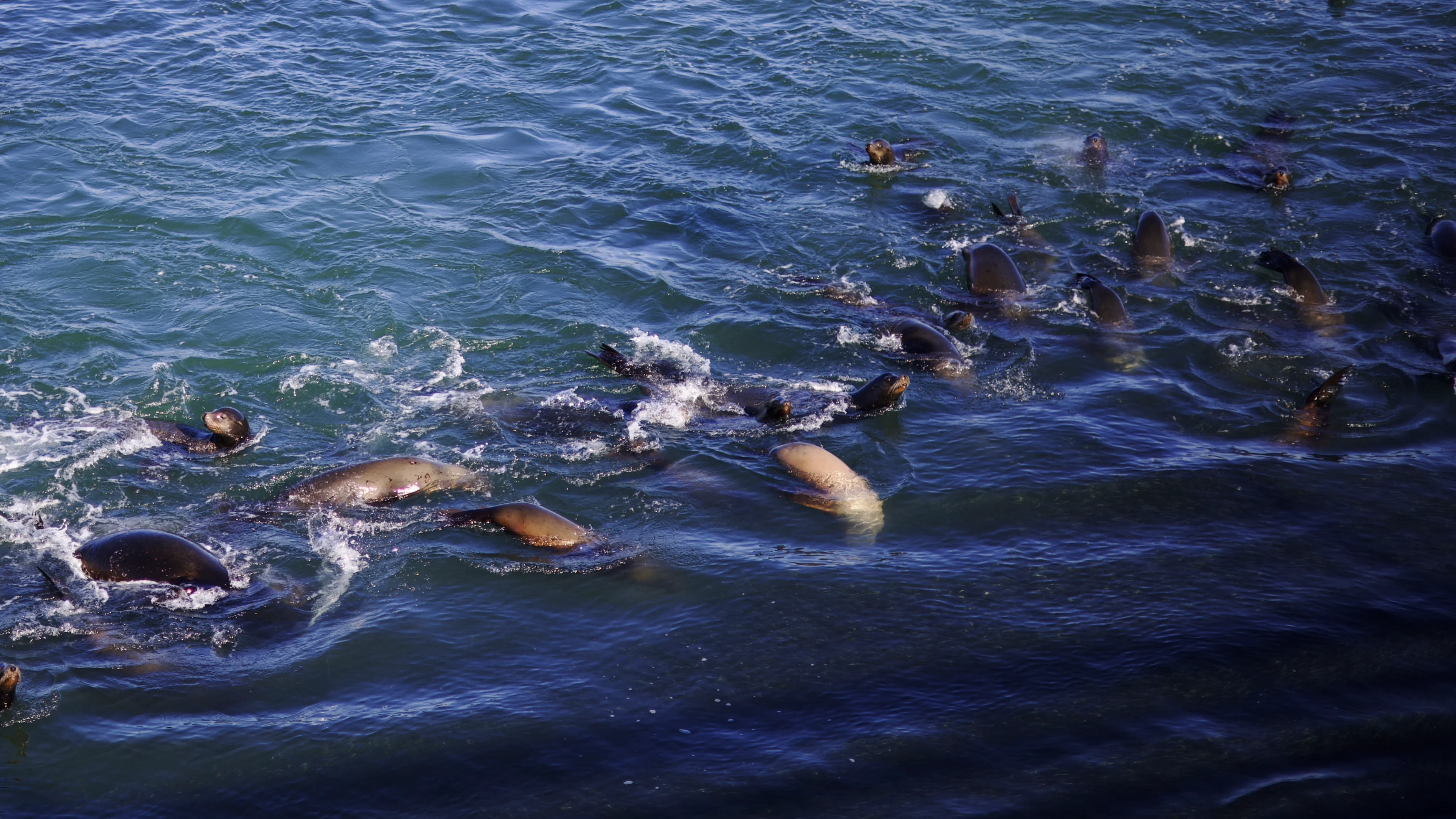
Hero: "https://files.xeiaso.net/hero/santa-cruz-seals.webp",
HeroAlt: "Seals piled on a rock at Santa Cruz",
})Toast for transient notifications, Modal for dialogs (using the native <dialog> element), Progress for long-running operations, Tooltip for hover hints. Modal and Toast both need JS to be actually useful — the design system gives you the styles and lets you wire the behavior yourself. I'm not shipping a framework, just opinions.
The design system only uses two shadow sizes. Don't add a third.
Your settings were persisted. For real this time.
That action will email every sponsor on file.
Couldn't reach stickers.xeiaso.net. Avatars will 404 until it's back.
@xess.Toast(xess.ToastInfo,    "Heads up",        p("..."))
@xess.Toast(xess.ToastSuccess, "Saved",           p("..."))
@xess.Toast(xess.ToastWarning, "Careful",         p("..."))
@xess.Toast(xess.ToastDanger, "Something broke", p("..."))// Trigger button points at the modal's id via data-modal-open.
// design.js calls showModal() on the matching <dialog> when clicked.
<button type="button" class="xe-btn xe-btn--danger" data-modal-open="demo-modal">
Delete this post
</button>
@xess.Modal("demo-modal", "Delete this post?", false, modalBody())@xess.Progress("0.64", "1", "Rebuilding search index")Hover or focus the underlined term to see the tooltip:Gruvbox
@xess.Tooltip(
    "Warm-neutral palette designed by Morhetz",
txt("Gruvbox"))DefinitionList for term and description pairs, Stat for big-number portfolio blocks, Timeline for career pages, Table with a horizontal-scroll wrapper so wide tables don't break mobile. When you're reaching for these, you're probably building an /about page or an experience timeline, and that's fine — those pages exist.
@xess.Stat("47", "Components")
@xess.Stat("35", "Color tokens")
@xess.Stat("11", "Type scales")
@xess.Stat("1", "CSS file")@xess.DefinitionList([]xess.Definition{
{Term: "Podkova", Description: "Serif typeface for headings..."},
{Term: "Schibsted Grotesk", Description: "Variable sans-serif..."},
{Term: "Iosevka Curly Iaso", Description: "Custom-cut monospace..."},
})Hugo-based. Blog posts in markdown. Looked like a 2018 tech blog.
Deno-based static site generation with JSX components. Conv and Picture were born.
Design language pulled out of the site as a reusable package.
The demo page you're reading right now.
@xess.Timeline([]xess.TimelineEvent{
    {When: "2018", Title: "xeiaso.net v1",  Body: p("Hugo-based...")},
    {When: "2022", Title: "Switch to Lume", Body: p("Deno-based...")},
    {When: "2024", Title: "xess extracted", Body: p("Design language...")},
    {When: "2026", Title: "cmd/design.within.website", Body: p("The demo...")},
})| Token | Value | Used for |
|---|---|---|
--radius-xs | 2px | Sticker avatar frames |
--radius-sm | 4px | Inline code |
--radius-md | 6px | Cards, details, pre, admonitions |
--radius-lg | 8px | Tags, blockquotes |
--radius-xl | 12px | Pill buttons |
@xess.Table(tableInner())

templ tableInner() {
  <thead><tr><th>Token</th><th>Value</th><th>Used for</th></tr></thead>
  <tbody>
    <tr><td><code>--radius-xs</code></td><td>2px</td><td>Sticker avatar frames</td></tr>
    ...
  </tbody>
}